Neutral decorating gets a reputation for being "safe" to the point of boring, but that's usually a failure of execution, not a limitation of the palette itself. A well-executed neutral room has just as much visual interest as a colorful one — it's built from texture and tone instead of hue.
Vary Your Neutrals, Don't Flatten Them
"Neutral" doesn't mean one flat shade of beige repeated everywhere. Layer several related neutrals — a warm white, a soft tan, a deeper taupe, maybe a near-black accent — so there's still contrast and depth even without introducing a "color" in the traditional sense.
Texture Does the Job Color Usually Does
In a colorful room, different hues create visual interest. In a neutral room, that job shifts to texture — a nubby wool throw, a smooth linen sofa, a rough jute rug, a glossy ceramic vase. Without texture variety, a neutral room genuinely can flatten into boring; with it, the room stays visually rich.
Use Natural Materials Generously
Wood grain, stone, rattan, and other natural materials bring in visual complexity (grain patterns, natural variation) that a flat painted surface can't — they're one of the easiest ways to add interest to a neutral room without introducing color.
Contrast in Value, Not Just Hue
Even within a neutral palette, contrast between light and dark values matters — an all-light-neutral room can feel washed out and shadowless. A darker neutral accent (a black light fixture, a deep charcoal chair) gives the eye something to anchor on.
Let One Element Have Real Presence
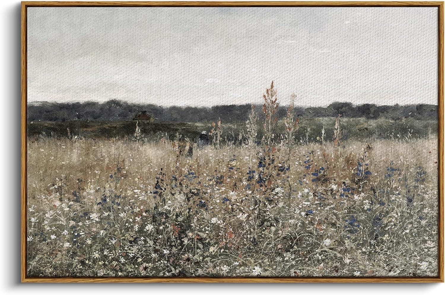
A neutral room still benefits from one piece with real visual weight — a sculptural light fixture, an oversized piece of art in muted tones, an architecturally interesting mirror. Neutral doesn't mean every element should be quiet; it just means the color story stays restrained.
Layering Beats Matching
A common mistake in neutral rooms is choosing everything in the exact same shade, which reads as flat rather than sophisticated. Deliberately layering slightly different, related neutrals (rather than matching them precisely) is what makes the difference between "calm and considered" and "boring."
Bottom Line
A neutral room stays interesting through texture, material variety, and value contrast — not through introducing color. If your neutral space feels flat, the fix is usually more texture, not a bolder paint color.